Creative Collab 1 | Coca-Cola + Mondrian
For more information on the Creative Collab, please read the first post.
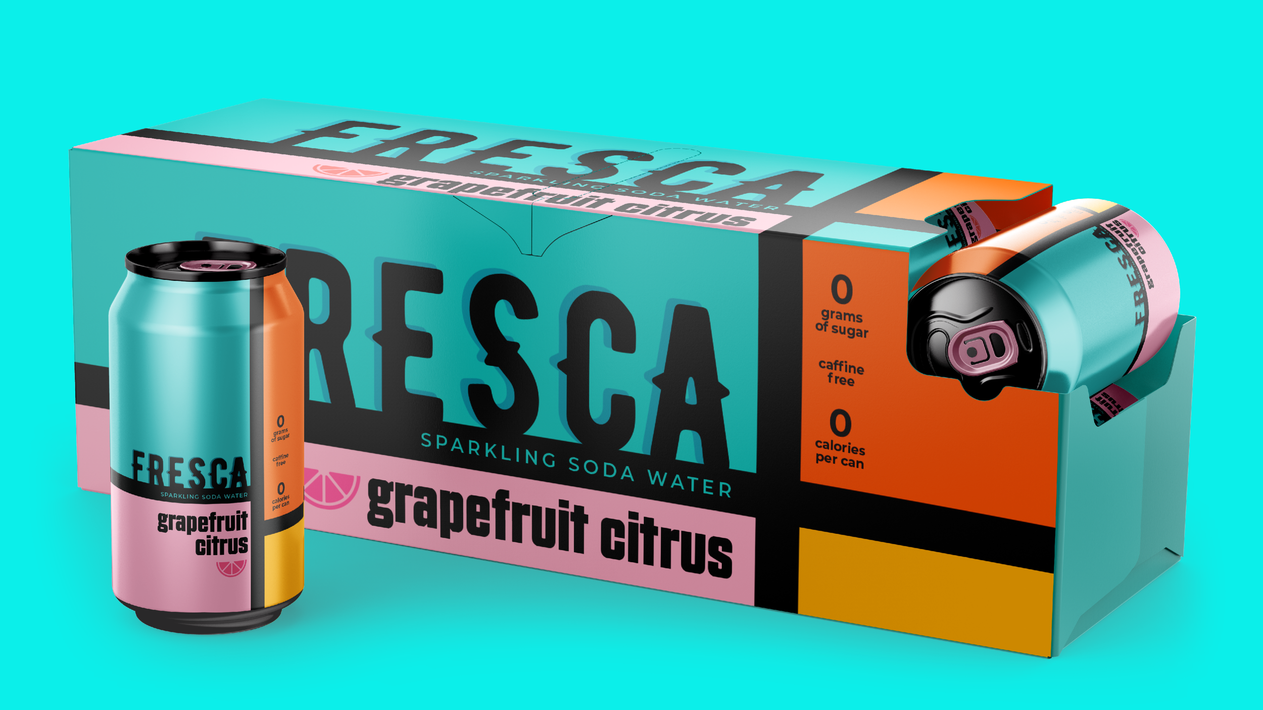
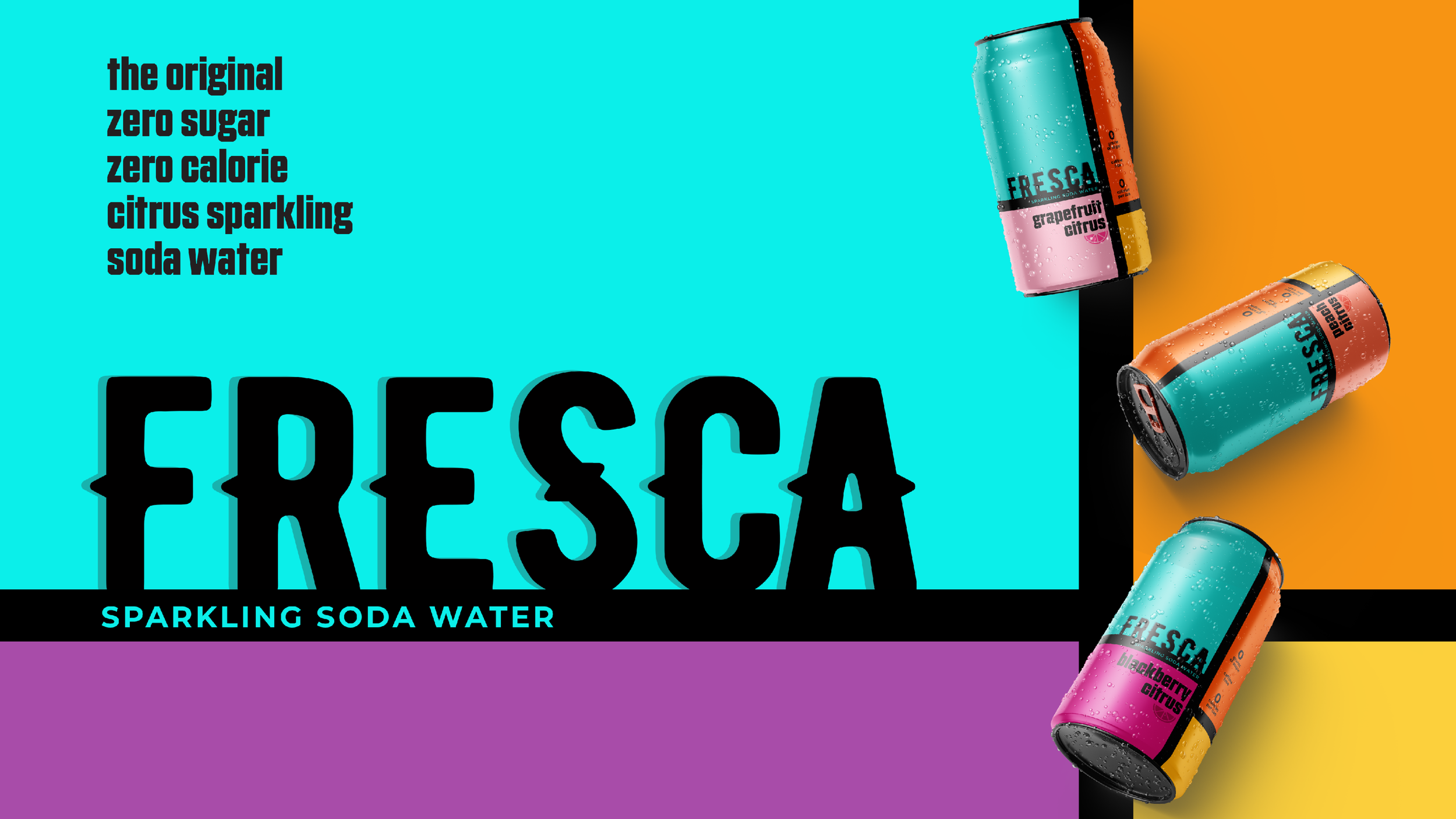
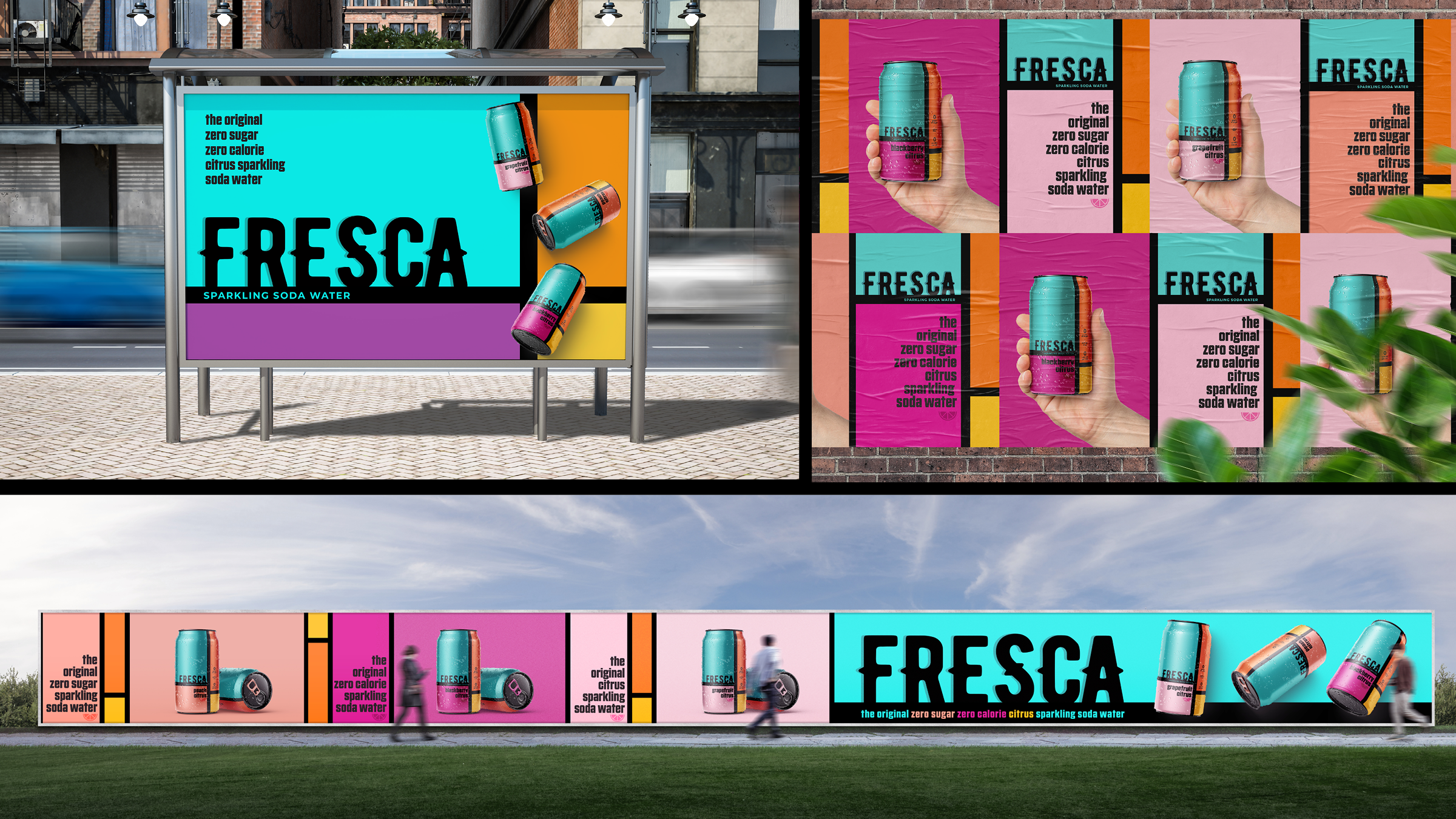
At the heart of all great packaging design lies strong concepting that fuels beautiful, innovative solutions that leap off the shelf and into the hearts of consumers. This page deconstructs a project at Rainwater Creative Design Studio as part of an internal workshop to refine skills with unique ideation, and to leverage new tools and technologies for concepting work outside the bounds of a client’s brief. The result is a unique and innovative packaging concept that is still practical for a major commercial brand with wide retail distribution.
To push the boundaries of creativity for packaging design, I decided to use random chance. I put 50 major consumer brands onto a list. I built a second list with 50 major 20th Century artists. I used a random number generator to select a consumer brand, and then an artist. My challenge was to re-design the selected consumer brands’ packaging and go-to-market designs through the lens of the selected artist. After running the random number generators, fate chose Fresca by Coca-Cola as the consumer brand, and Piet Mondrian as the artist. Now, I had to bring them together.
Mondrian famously distilled his designs into their most powerful and elemental components to reveal the mystical energy and balance of universal forces at play in the world around us. He advocated pure abstraction with a disciplined palette of only a few colors to capture a utopian ideal of universal harmony. Mondrian believed that his modern art could transcend divisions in culture, and create a new common language for connection, based in primary colors, flat forms, and dynamic tensions. The blocks of color and differently weighted lines create rhythms that ebb and flow across the canvas, echoing the sometimes-chaotic rhythms of modern life. All these themes guided the high concept of the packaging re-design for Fresca.
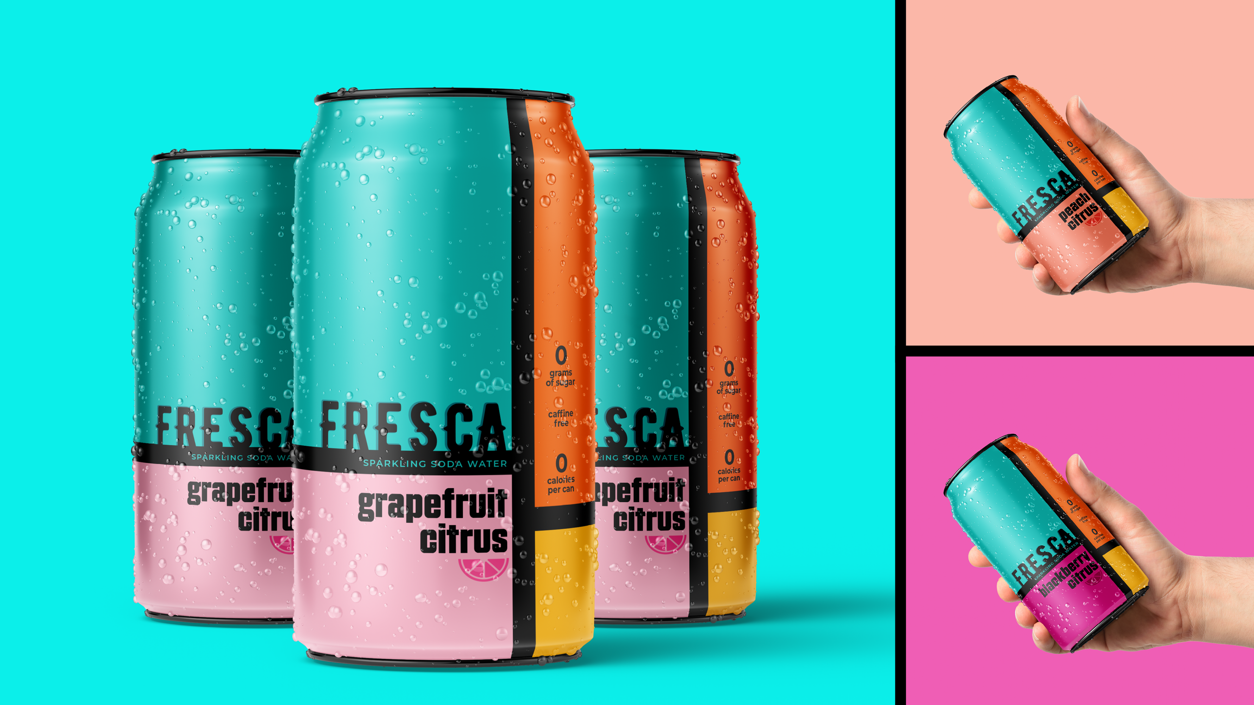
Although not tied to a client’s demands, the project’s focus was to create packaging that would amplify the commercial impact for the brand. To honor this objective, I committed to keeping true to Fresca’s brand DNA and specific product features and consumer benefits. Fresca’s long-standing teal blue was a mandatory ingredient. The unique, sparkling citrus flavor and zero sugar ingredients are key aspects of the brand, and so rose to the top of salient product attributes to highlight in the re-design. Although not shackeled by cost implications of wild packaging executions, having worked with Coca-Cola in the past, I wanted to adhere to realistic packaging elements they might actually use.
With a clear challenge, and a clear set of building blocks, I began work researching the competitive landscape including brands like Izzy, La Croix, Bublé, Spindrift, and Pellegrino. I examined changing consumer trends for Millennials aged 25-40, an important commercial segment for fast-moving consumer goods. Armed with an understanding of the context, I examined key questions the re-design would need to answer to be successful, including:
What are this market segment’s unique wants and needs? My research indicated they seek more balance in life.
What are the emerging competitive trends for the category? I observed an explosion of variety with less obvious flavors.
I knew I needed to create a personality for the finished packaging solution that would connect Mondrian’s unique visual aesthetic to Fresca’s unique refreshment in the mind of the Millennial consumer, so I began exploring how to meld these different elements effectively.
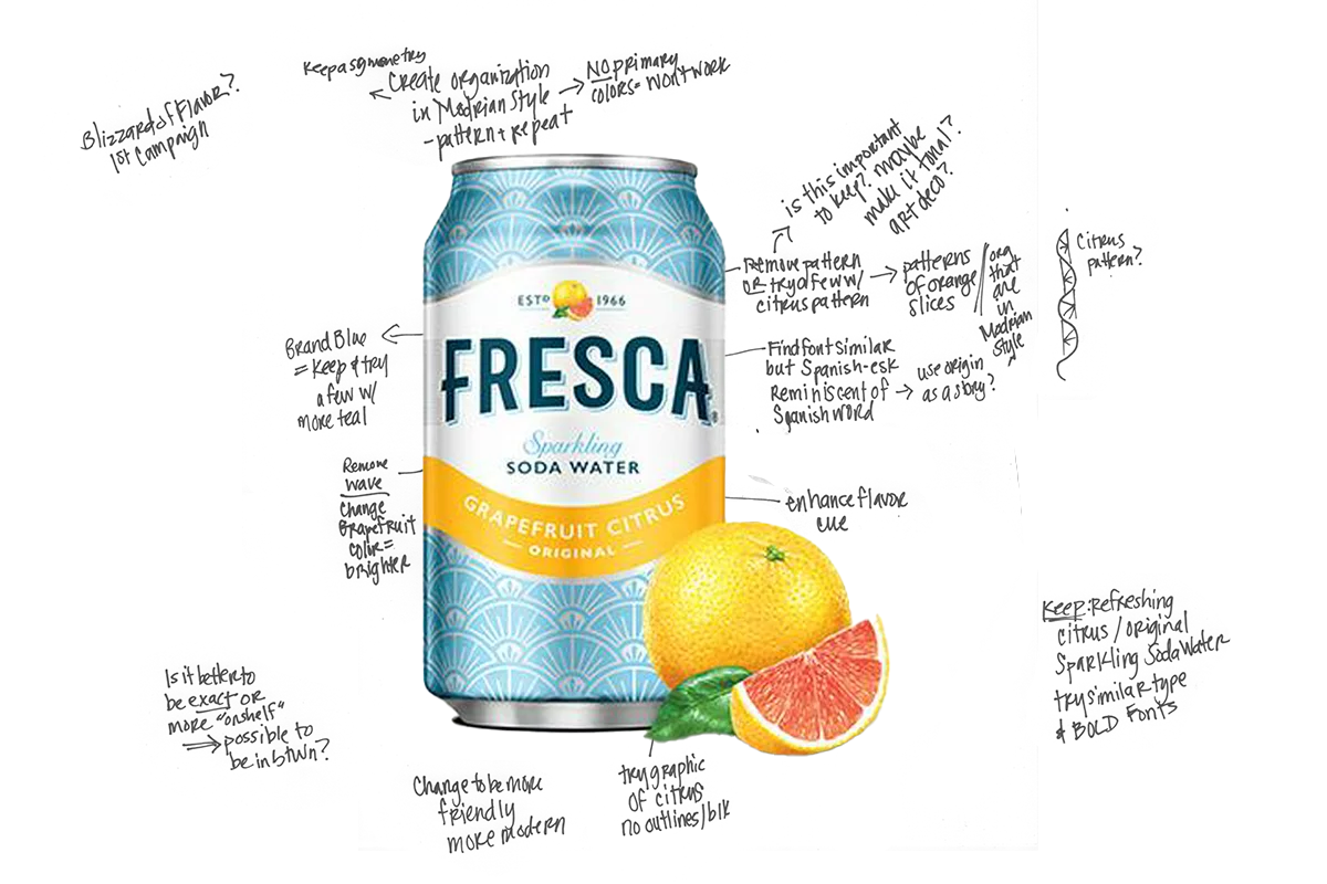
These strategic explorations filled pages with scribbles and phrases. I built mood boards and captured inspirational designs from outside the category. Finally, I synthesized the underlying stories into 3 proto-concepts that fully explored important elements the final solution would need to incorporate.
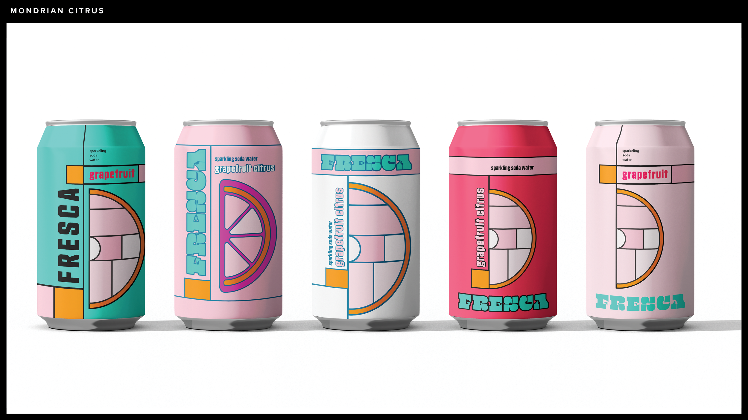
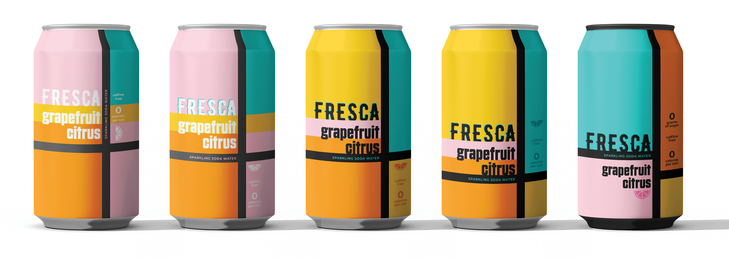
Idea #1: “Mondrian Citrus” This idea focused on bold Mondrianic color blocks in citrus shades of pink, orange, red, and teal to pick up on flavor cues from the product portfolio including grapefruit, peach, and blackberry.
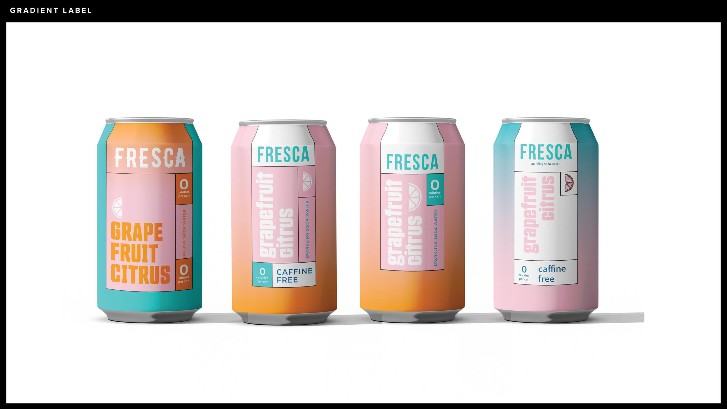
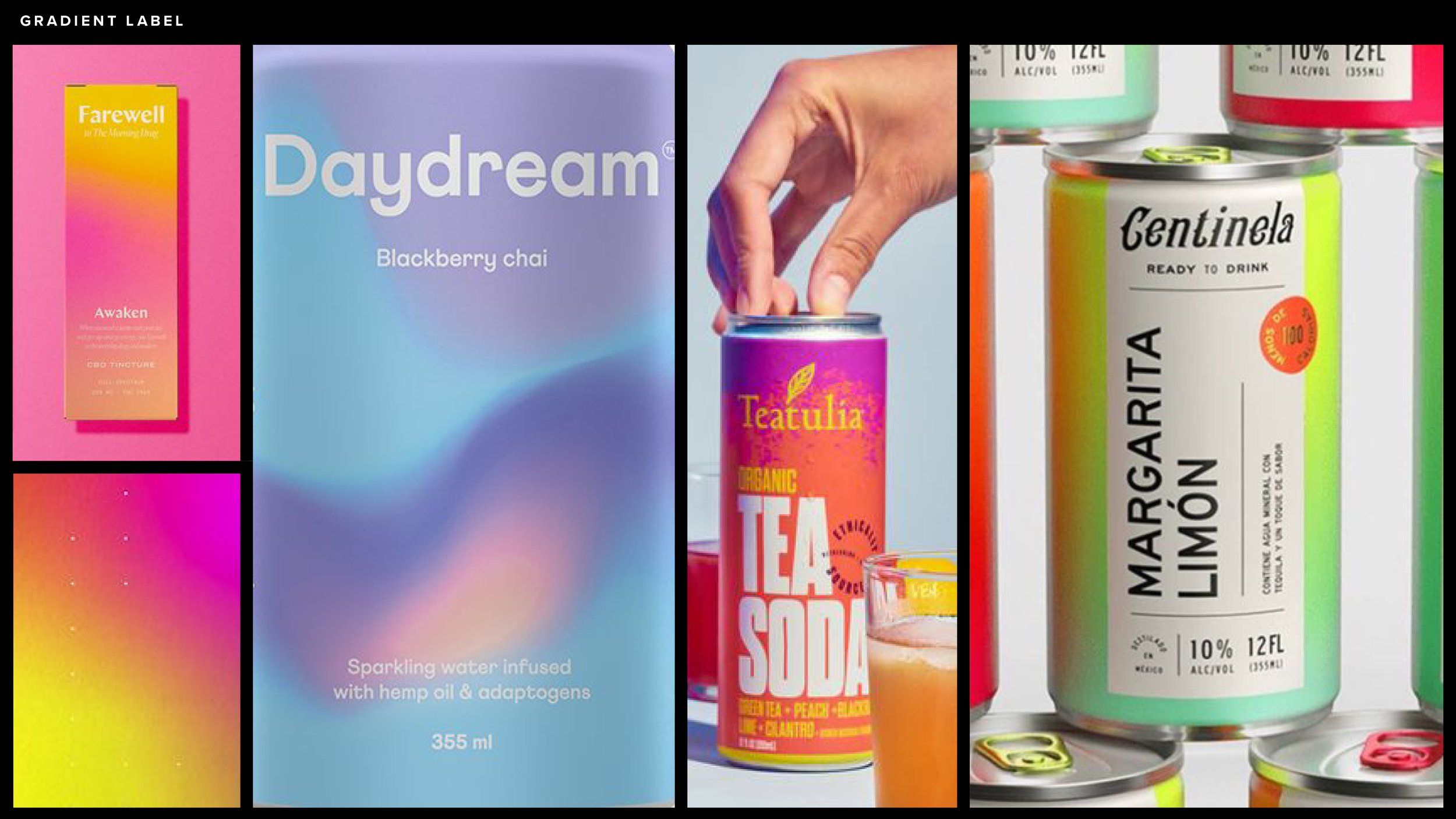
Idea #2: “Gradient Label” This idea paid homage to Mondrian’s intersecting black lines with active and approachable typography and beautiful gradients.
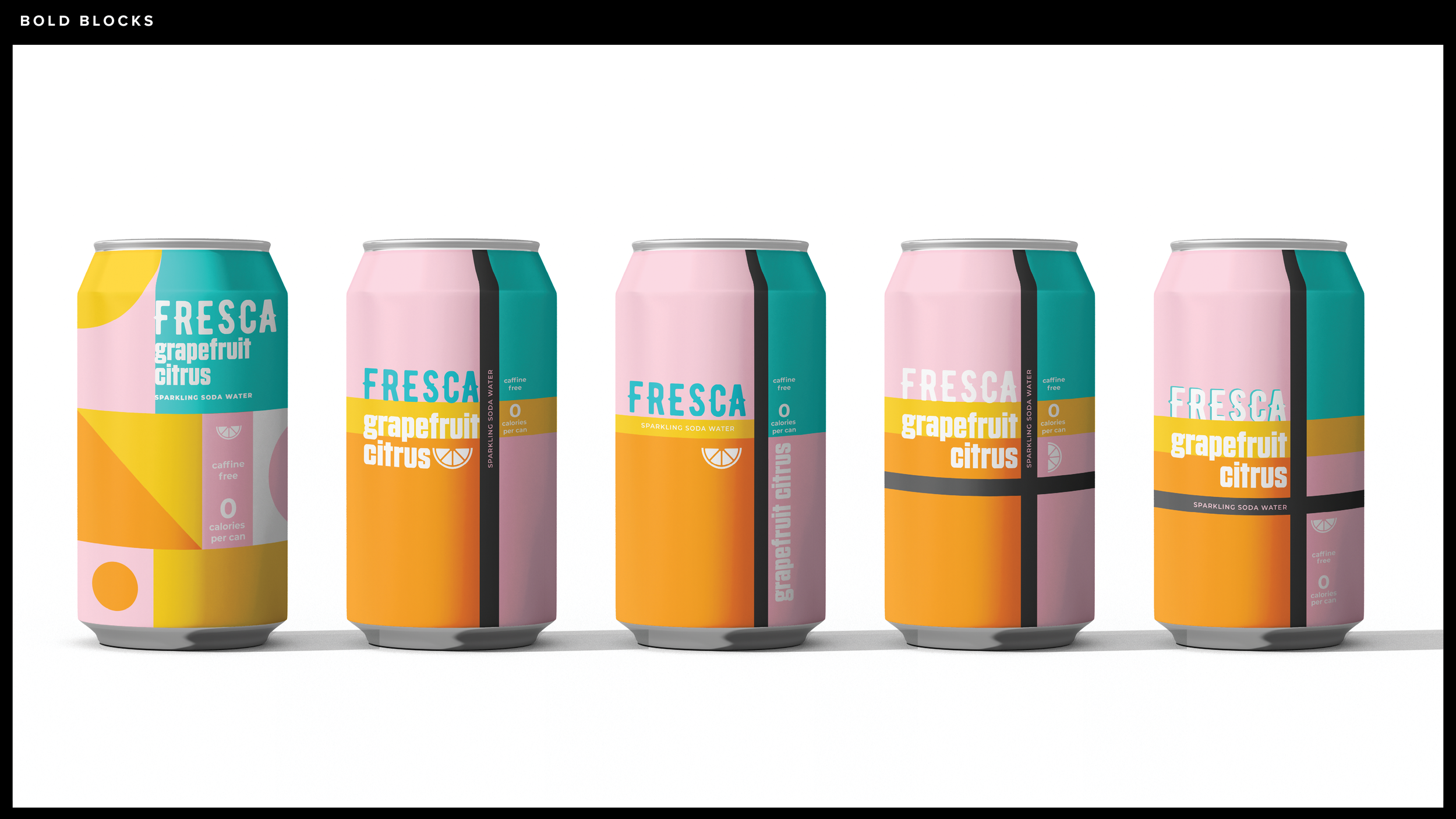
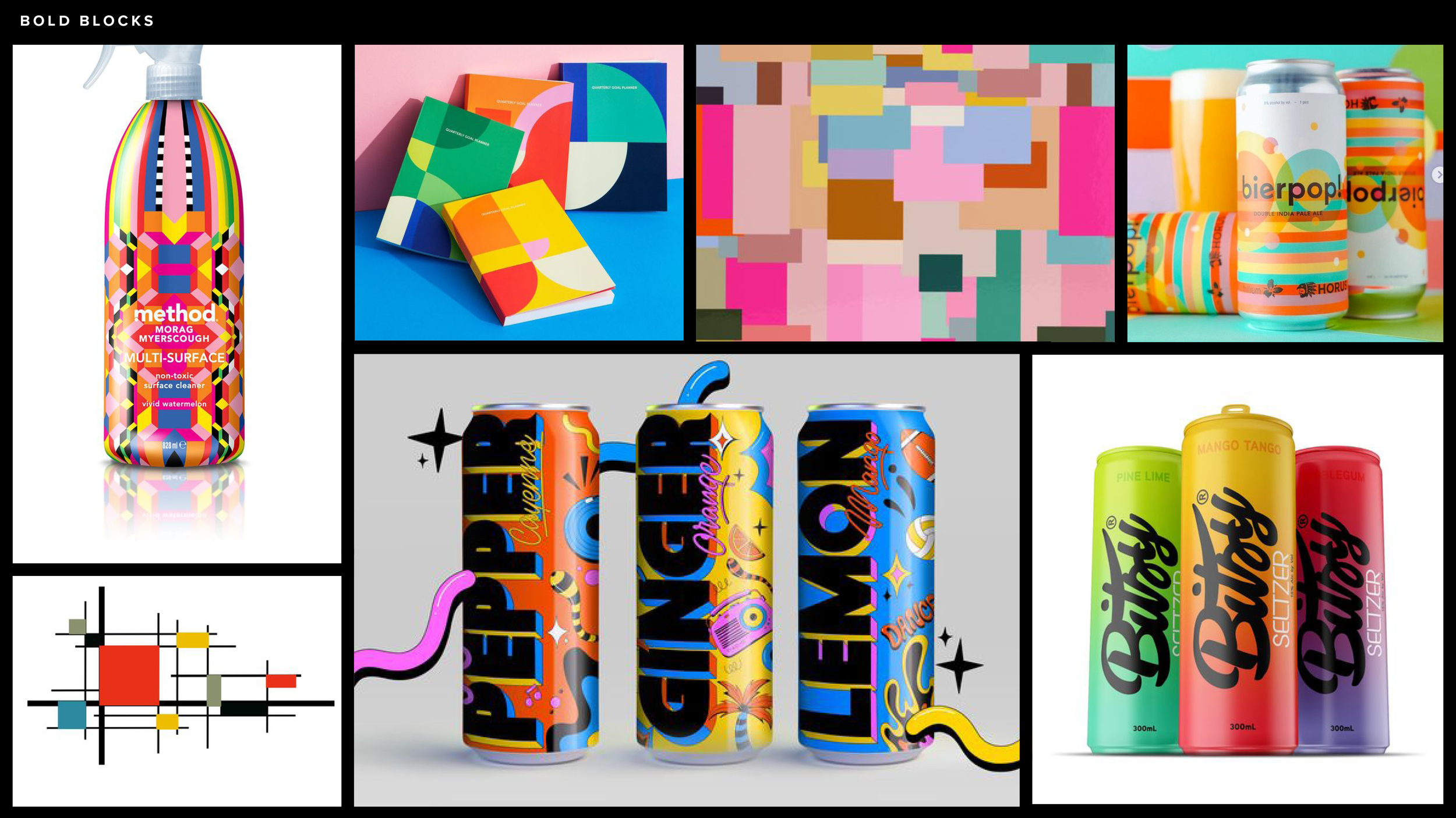
Idea #3: “Bold Blocks” This idea leaned in on the artist’s legacy of a simple hierarchy, and brighter colors that pop against the heavy use of black fields.
Moving from these abstractions to concrete applications, I distilled these ideas into visual representations, sketching on paper and screens, experimenting with different iterations of images, typography, and color to tell the best story. At this stage, I disciplined myself to use new techniques and learn new software to keep true to the original objective of expanding technical skills while strengthening my concepting muscle. I used a new stylus and program integrated with an iPad for the first time, and learned a new 3-D rendering approach using Adobe Dimension.
